Presentation Design Tips
Presentation Design Tips
Keep It Simple
Less is More: Try to have only one point per slide. One or two strong graphic images or a succinct line of text will tell the story better than bullet points, or long paragraph of copy, complex graphics or charts. The audience needs to process what you’re saying while at the same time absorbing your slide on the screen. So, rather than one complex slide, instead break it up into multiple slides, each with one main idea. This idea could be represented by a strong image, short phrases or data point.
Make sure you provide enough contrast between your content and the background. A simple background with solid color is best so it won’t be distracting or overpowering and drown out your text or main image. The text should also be large enough to see from the back of the room.
Use strong visuals to support your message. Half of our brains are wired to process visual information. Like the old saying goes “a picture is worth a thousand words”. So, instead of putting on the words on the slide, move them to the speaker note area or print handouts and instead find a strong image that captures the essence of your message and show that image instead. Otherwise, we tend to read ahead of the speaker and not fully pay attention to what he/she is saying. Use a photo to emotionally connect with the audience, engage them in a total immersive experience.

Always use high quality graphics either custom illustrations (think infographic type of imagery), or photos shot yourself or perhaps purchased professional stock photos (for example through either iStockphoto or ShutterStock). Don’t just download an image from some website (beware of copyright issues) and then just stretch a small, low-resolution photo to make it fit your design causing the photo to show pixelation and lose its integrity. Our designers often use lifestyle images of people on the slides we designed for our clients, they tend to help connect with the audience on a more personal and emotional level.
Color evokes emotion…it helps persuade and motivate. Appropriate color usage can increase interest and improve comprehension and retention. Use your approved brand colors to help establish connection with your brand. Use cool colors (blue or green) in the background and warm colors (orange or red) in the foregrounds to make them pop. If you’re presenting in a dark and large room, a dark background with light text (white or yellow) will work best. However, if you’re presenting in a well lit room, then a light background with dark text should work better (dark background with light text tend to washout in a bright room).
Custom Designed Presentation: Design your own theme and templates, don’t just use the standard templates included in PowerPoint. You want your presentation to represent your brand and professional image. Besides your audience expects a unique presentation, not cookie-cutter slides. Professional designed templates are available online or you can find well a qualified presentation company to help with your presentation. There’re many great presentation companies out there so choose carefully and be sure to review samples of their past work. Remember, you only have one chance to make one great first impression.
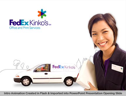
Opening Intro or Animation: Use a short video or animation to engage your audience and get them excited about your presentation. It can be 20-60 seconds long and shouldn’t be more than 2-3 minutes. Think of it as a movie teaser to pique the audience interest. You can create the animation in Flash and then insert it into to your PowerPoint presentation. Be sure to add appropriate scripts to help it auto-rewind and refresh the screen.
You can also add a Flash movie to your interior slides to help explain or convey a concept. See how we add interactive navigation menu on the right in our client’s slide below to help bring up Google Earth video showing our client’s plant location in various cities around the world.

We hope these tips are helpful with your next presentation. If you ever need any help with your preparing a presentation for your next important meeting, our presentation design team will be glad to help. You can check out our presentation design and development services here.
James Faulkner is SodaPop Media’s Content Manager and Creative Director.


