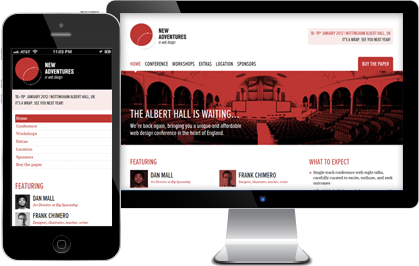
Responsive Design, Designing Modern Website with Mobile First Approach
Responsive Design, Designing Modern Website with Mobile First Approach
Is your website ready to handle rapidly growing traffic from mobile and tablet devices? If you check your website analytics recently, you will see a growing trend in traffic coming to your website from devices other than traditional desktop computers.
Responsive design is a concept where you build your website so your site can adapt to any devices or screen sizes. HTML5, CSS and media queries allow web designers to build the sites so that the content on the page will resize itself to the user’s vertical or horizontal viewing mode…whether viewing on a smartphone such as iPhone, an Android device, a Windows Phone, a BlackBerry, on a tablet or even on a traditional desktop or a TV set.
Desktop and Mobile Website
Google recommended that web site design and development process should follow industry best practice of using responsive web design and the site should serve the same HTML for all devices and using only CSS media queries to decide the rendering on each device. The media queries should be able to detect the visitors’ display sizes, screen resolutions, browser type and devices.

Mobile First Website Design Strategy
A true responsive website means that there is no need for a duplicate version of your website (a desktop site and a mobile site). The site can be built based on a single code base and the server can render the page layout on the fly. This ensures a much better user experience since the site is tailor-made for them. The site will also load much faster since it was developed from a “mobile first” mindset. Among a popular content management system (CMS) that truly supports responsive design are WordPress and Joomla. Joomla actually runs on Bootstrap framework (a popular, sleek, intuitive, and powerful front-end responsive framework developed by former Twitter developers), both of its front-end and back-end admin user interface are responsive right out of the box.
Google recommended that web site design and development process should follow industry best practice of using responsive web design and the site should serve the same HTML for all devices and using only CSS media queries to decide the rendering on each device. One of the great SEO benefits of responsive design is the ability to serve just a single URL for a page, rather than a separate URL for mobile devices (example: yourwebsite.com vs. m.yourwebsite.com).

Website for Smart Phones: Your site should be able to support a wide array of smart phone and tablet devices such as iPhone, Android, iPad and all the devices that support HTML5. Test the prototype of your site early to really see how a given layout will respond to different viewport sizes. Run your tests on actual devices to see how your site will display and behave on various devices. Make sure all the features and functionality work the same on all the different devices and browsers. For example, your customer maybe trying to locate your store or restaurant on their mobile device so your site should allow to be able to either enter their Zip code or use their current location to find you.
Some Client-Side Issues and Challenges for Building Responsive Web Design (RWD) and Web Application (RWA):
Devices still load all the extra and unused CSS behind media queries
The lack of browser-supported responsive layout systems
We still lack element queries
Keep in mind that responsive may not always be the answer for large and complex websites. However, for the majority of the websites especially the small to medium sized sites, responsive website is a perfect answer.
Click here to learn more about how we can help make your website responsive.
James Faulkner is SodaPop Media’s Content Manager and Creative Director.


